Tuesday, June 21, 2011

For all you photographers out there--HUGE giveaway


Check out all these awesome vendors!!! Huge giveaway and sale at the soulographer.

click here for details:
http://soulographer.com/

Tuesday, January 19, 2010

Changing the color of elements or papers.

Open a new file. Open the element that you want to change and open a paper of the color you want you element changed into.
The background layer should be on the bottom, with the element on top. The topmost layer should be the paper of the color you want your element to become.
Chose blending mode 'color' or try 'luminosity'.
Another option is to click IMAGE-ADJUSTMENTS-VARIATIONS and chose midtones.
Another option is to click the 'fx' icon and choose color overlay with the desired layer selected.

pretty easy

Changing the color of elements or papers.

making elements look like a sticker

I've been asked on how I made my "follow me " tag in my sidebar look like a sticker that is peeling off. Well here ya go.

First I typed out my text. Then I clicked on the little symbol in the layers pallette,"fx" and chose the option 'color overlay'.
With that layer selected, I clicked CTRL-L to get a new layer. (CTRL just makes the new layer go underneath the active or selected layer).
Now I expand the marching ants(the selection) by chosing SELECT-MODIFY-EXPAND. Chose your preffered size. Now chose the paint brush tool. Chose the color white and fill the inside of the marching ants.
Now you need to add a drop shadow to make it look like the sticker is being peeled off. I warp the drop shadow to my liking.

Tuesday, December 29, 2009

templates

I really love to personalize my own scrapbooking pages, like the one below. I used a ligth polka-dot paper for the background. I used brushes to stamp on the flowers and the text. Then I used clipping masks to create the shape of each photo that got plopped onto the page. But Several designers create cute, gorgeous,read-made templates with fabulous designs and all you have to do is drag your desired photos to the template. You can even create templates yourself. Check out some of my previous posts for links to scrapbook and photo websites. Many have templates for free download and some have them for purchase.

Out of Focus

I love the mysterious element of things out of focus. My husband purposely focused on the leaves in the foreground, pushing me out of focus.....i love it. 
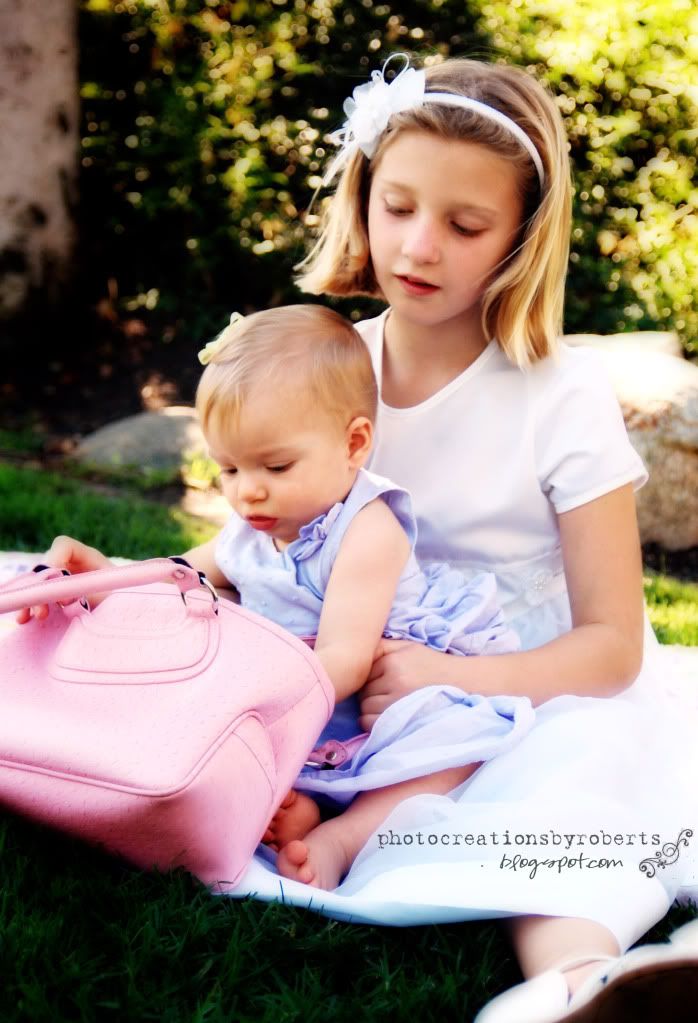
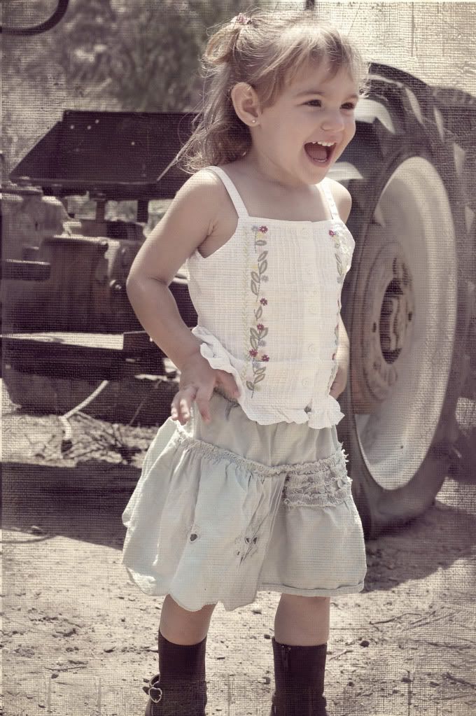
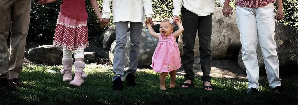
I wanted to highlight this cute little toddler, but I wanted to give her a sense of belonging, so I put her parents in the background, out of focus to give more of a story to the photo.


Saturday, December 5, 2009

What's your style

I love this bridge for a larger family pic, like these below. But I am trying to decide my favorite style. All three pics are the same.

original-


a pop of color and contrast- (perhaps the high contrast background is too distracting)


a little more creamy background-(I think I like this one the most!!!!) What do you think?

Friday, December 4, 2009

Nothing's Missing


I don't know why I am so fascinated with taking pictures of just half a person's face, or their lower half only, but It begins to tell a story, but leaves it somewhat mysterious. I just LOVE this picture with her hands placed perfectly on her lap. It seems so priceless to me.

Going Candid and trying new Angles

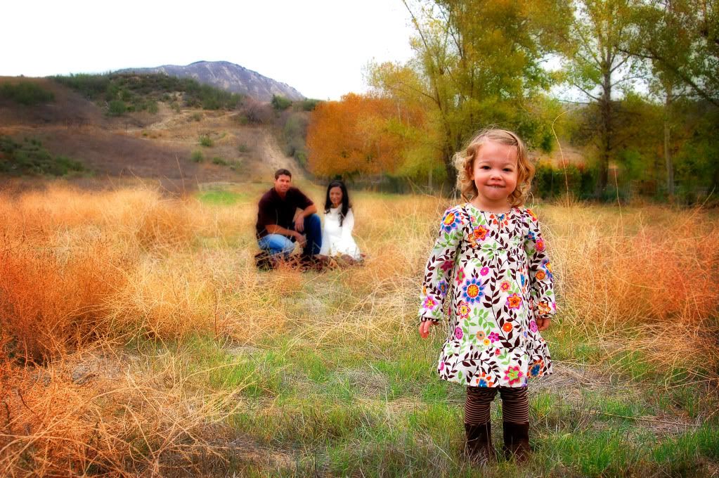
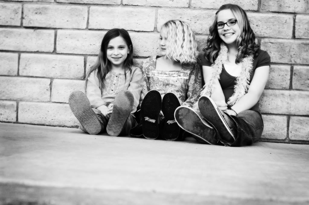
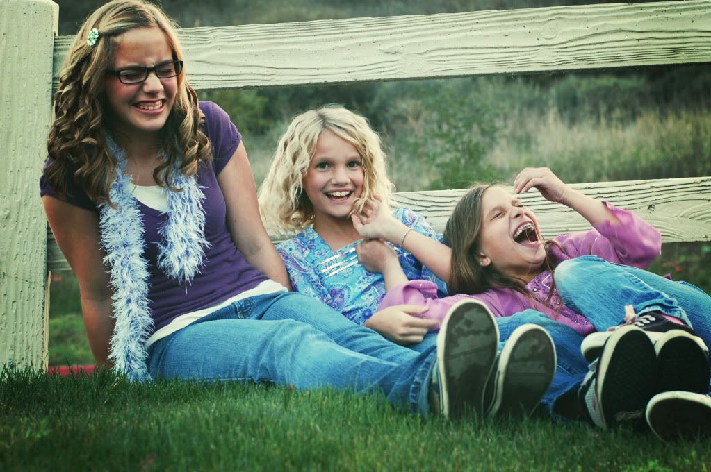
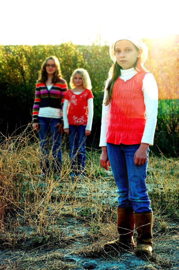
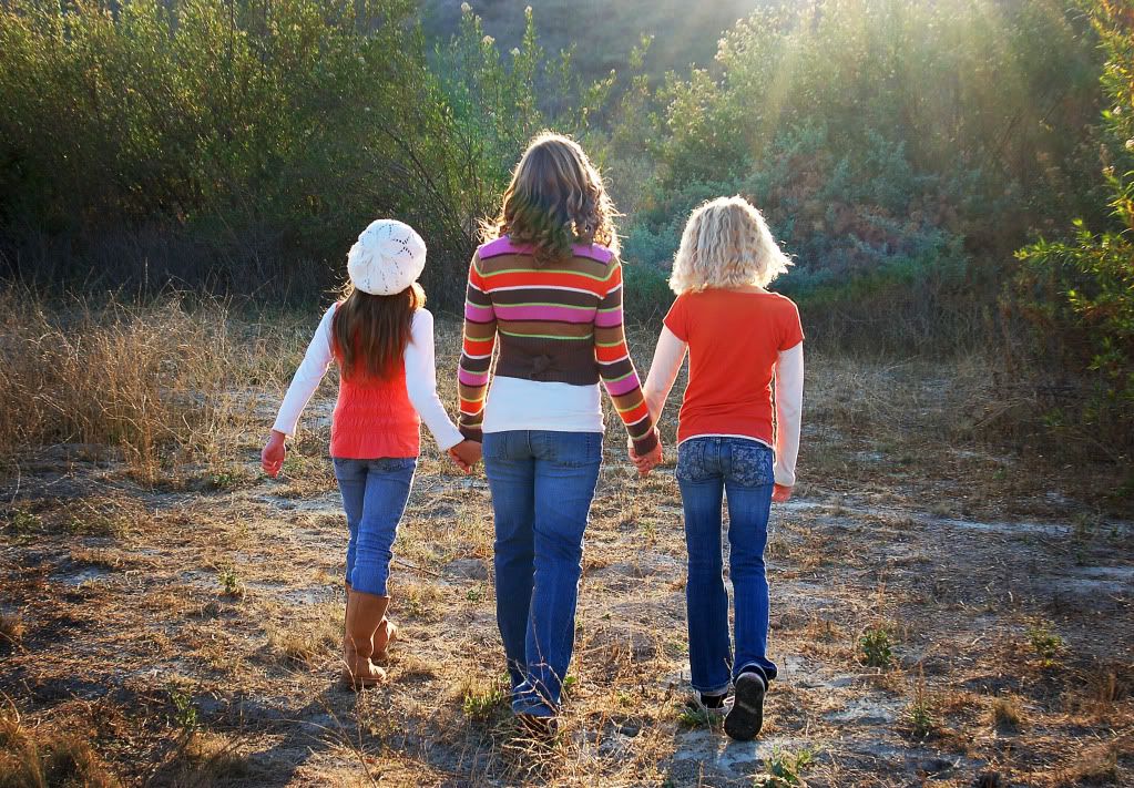
I posted some sneak peak pics of these gorgeous girls, discussing the use of sun in the photo to give it a very unique look. Well later in the day of picture taking, the sun went down when the girls did a clothing change. So I went for more of an urban feel and tried new angles. I laid on my stomach and shot the picture below very close to the ground and I absulutely love the way it looks from this anle. I asked the girls to stop 'posing' and just be themselves to capture a moment, rather than a posed shot. There is something so precious about these candid moments.
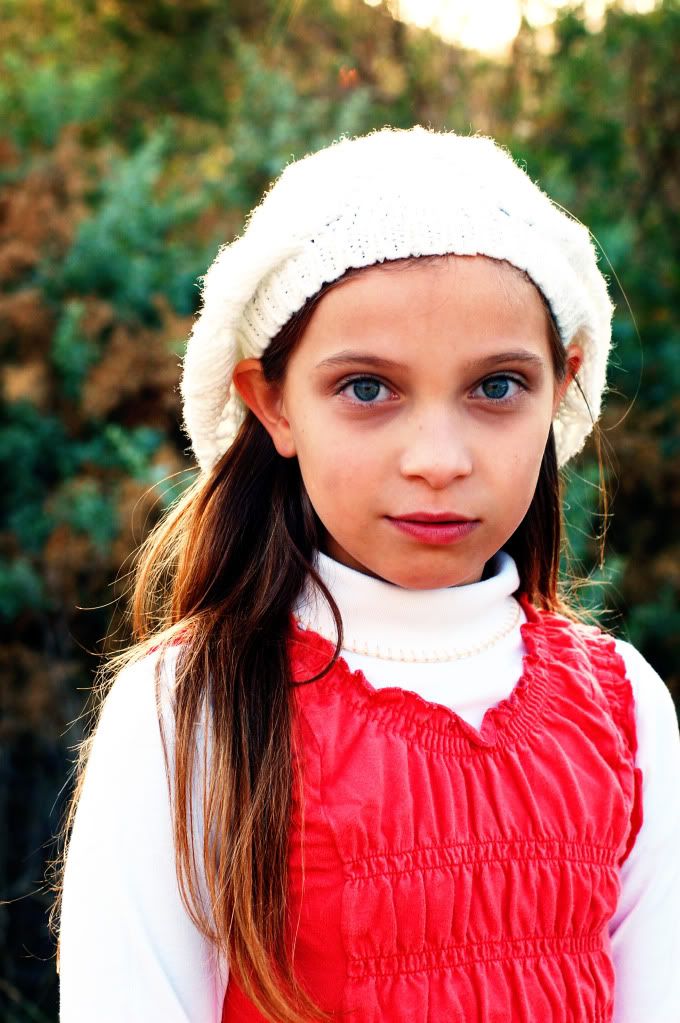
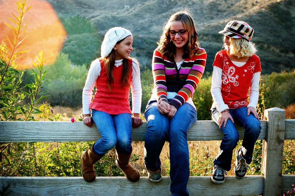
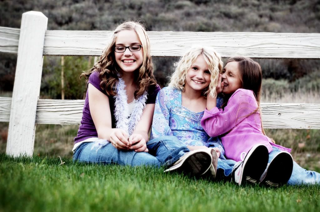
Ok, so the pic below is posed, but I just love her eyes, I just had to add this pic to the post. If they have green eyes, get some green in the background to help them pop, same with blue eyes. It's just a little tougher to find blue backgrounds.
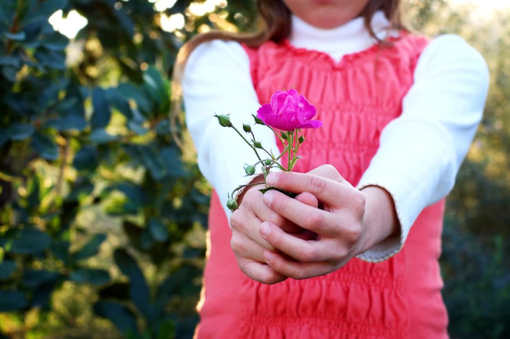
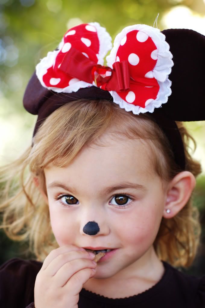
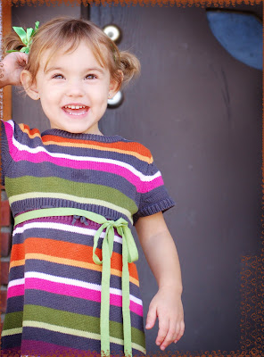
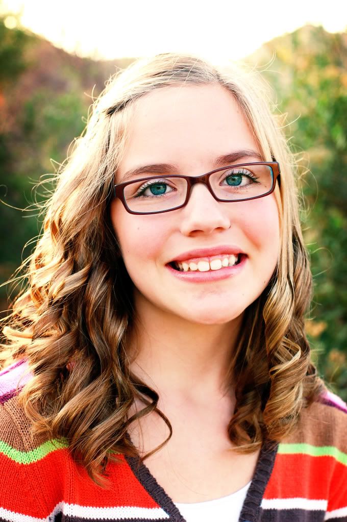
Once again the photos below are shot from a really low angle and are candid, making this photo a fave.


I put more of a retro look to this one. I just loooove the look of retro.


Thursday, December 3, 2009

how to make your own unique brush


The logo you see on the photo above is a brush I made myself. Here is how I did it. First I opened a picture of a bird, see photo below. Of course, you could always draw a custom logo and scan it instead.

Then I took the magnetic lasso tool to carefully select the shape of the bird. I continued to expand the selection until I had it just right.
Next, I opened a new blank file to go on top of the bird selection. With that new layer selected, I clicked on my paint bucket tool (set at black) and then clicked on my selection in the photo. This then turned my selection all black, see photo below.


I then dragged the bottom layer (background layer) to the trashcan, since I do not need it anymore. Then I opened a new blank file at 2 inches tall and 10 inches long. I dragged my new black bird on top of the new blank file. I used a white damask brush at 50% opacity and stamped a pattern onto the bird. see photo below.


Then finally, I added some text and I used the line tool to draw a box. Now my brush is ready. I clicked on select--select all and then edit--define brush from selection. I named my brush and hit ok. Now my brush is the last brush in the brush pull-down menu. Now I just stamped that brush onto the first photo in this post.

Tuesday, November 17, 2009

How to make a personalized watermark


Very, very easy to do. First, open a blank file at desired size. I chose 1" heighth x 3" width.
Then I used different text fonts and wrote my blogspots name in black. Then I opened up a swirly brush and stamped it next to the left of my text. Now, click on select-select all (to select your image). Then, click on edit-define brush from selection. Name your watermark in the pop up box and you are done. You will now see your image as a brush that you can now stamp onto any photo. You can choose any color and any opacity. You can see the first photo in this post is with a black brush, set at 75% OPACITY. The second is white at 25% and the last photo is white at 75%. You can adjust the brush size based on your photo. Now don't forget to SAVE your brush as an .abr file, so you can use it again. I always forget to save it, but when I select a new set of brushes, PSE sends a pop up box to remind me that I need to save it. Now it is always there for future use. If you want to save image onto your computer, be sure to save it as a .PNG file.


Adding texture to a photo

Do you ever wonder how people make their photos look like this? They add texture.
There are several places you can download free textures, see the bottom of my post. The following pictures show a photo, a texture, and the combined texture added to the photo. Here is what was done. First, open the photo and the texture. Drag the texture on top of the photo. Chose a blending mode. In the example below, 'vivid light' blending mode was selected. Then a layer mask was added to mask out the texture effect on the face, skin area.
Here are some of my trials with this. I added dark scratches to the photo below, and then used a layer mask to mask it off of the person. Try all differnt blending modes. Start with 'overlay' and 'screen' at different opacities. Keep trying other blending modes until you get the look you want.


And on this photo below, I used a linen texture, and again used a layer mask to mask it off of her face and body.

Saturday, November 7, 2009

Sneak Peak...."Here Comes the Sun"


I did a photo-shoot today right as the sun was going down. I am loving the hazy effect the sun gives these shots. I will probably post about 10 more pics from this shoot, but here is a sneak peak.


Thursday, November 5, 2009

Family photo shoot


A couple of weeks ago, I did a family photo shoot for a local family. At the end, I did some individual portraits of each child. They changed clothes to fit their own style. He did a great job of giving me attitude for his sk8ter pics.

Blending Modes


What are Blending Modes? From your photoshop software, you will notive a drop down menu in your layers pallette. It defaults to say "normal", but you can click on it and see several types of blending modes, like color burn, linear burn, overlay, etc. So here is what that means.

Let's say you open up a photo. Now click on the thumbnail of that photo in your layers pallette and select duplicate. Now you have the duplicate image on top of the orinial image. Because your blending modes is defaulted to normal, your photo will look the exact same. Now, with the duplicate layer selected, chose a different blending mode. Below, you will see what different blending modes will look like when you blend a photo with it's duplicate.


Well, now you may ask, what will my photo look like if I blend it with something else. Well, you will only know if you try, but below you can see what this photo looks like when blended with a neutral piece of scrapbook paper.

Now this can very addicting as you now try to put several blending modes on top of eachother. So let's talk about the first photo of this post, with the 4 kids on the bridge.
First I opened the photo and then I dragged a neutral color paper underneath of it. I chose the blending mode, linear burn.
2. I made a duplicate of the photo on top of it and chose blending mode, screen.
3. I made another duplicate on top of that one and chose, linear light.
4. You will have to play with the opacity of each layer to taste. I wanted to desaturate it a little, so with the linear light layer selected, I clicked on image-adjustments-hue/saturation. Once the pop-up box came up, I slid the slider down, to decrease saturation. Do what looks best for your photo.
5. Finally, I took the same paper from the bottom and added a new layer with it on the top and used the blending mode, saturation. Now I am liking the way this photo looks. You might spend hours getting exactly what you want, but practice, practice.
Now, I can't remeber the exact blending modes I used to go from this BEFORE:
to this AFTER:
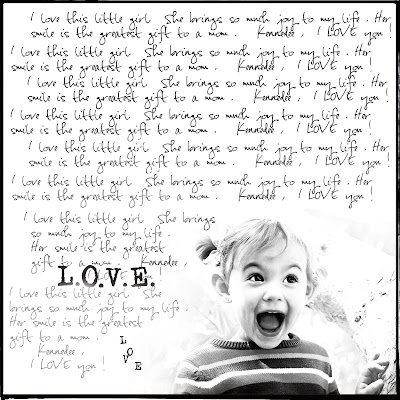
but, I played with it enough to make the background as light as possible after first making it black and white. Once i did that, I placed the photo onto a 12 x 12 new page. I placed it in the corner. I got my eraser tool and set it to 33% opacity and erased around the edges of the photo so it wasn't a blunt rectangle. Then I got my type tool and wrote a few sentences about my daughter, copy and repasted it all over the 12 x 12 layout, staying clear of the photo part. I used my eraser tool with a low opacity to lighten up the text on the bottom left hand corner so that when i wrote the word l.O.V.E, you could see it better. And I finished it off with a border.

Thursday, October 29, 2009

Shapes

option #1
option #2

I had seen photos cut into really neat shapes, and I just had to figure this one out. Photoshop comes installed with several shapes. All you need to do is open a photo or scrapbook element. Click on your shapes tool, then drag it across your photo. Move the photo around inside the frame and resize to taste. Sounds easy enough.
But what if you have an element that is not a shapes file.....and you want the photo to lie within the shape of that element?
First I open the blank document and add the shape ontop of it. I place it where I want it. Now I need to remove the white part of the shape. So I click on my magic wand tool and click on the white space. It should select the white area. Now I just hit delete and the white area is now transparent (checkerboard). Now I will flatten all images. Now, I double click on the only layer (the background layer) and rename it anything I want. By renaming it, It isn't locked anymore. I click on 'make a new layer' and drag that layer below my original layer. I add my photo to that new layer. Because this layer is below the layer with the shape, the photo is peaking right through it, just like a frame. Tricky, but once you got it, you got it. I just love these bracket frames.
To download more shapes, check out www.ladyoak.com. She has more than just shapes so check it out.

Tuesday, October 20, 2009

Bokeh and my new Nikon50mm f1.4


------------------------------------------------------------------Bokeh simply means when the background is blury....in otherwords, it is the out-of-focus area typically in the background. This allows the photo viewer to focus on the primary subject and not the distracting background.


So in the photos below, I wanted to get some Halloween pics of my daughter, but didn't want to travel for the 'photo shoot', so I did these in fron of my house, and using my new lens.......................the Nikon 50mm f1.4, which I love, it has such a high aperature, it is great for portraits. It allows the subject full focus and the background the BOKEH.


------------------------------------------------------------Now in this photo, because my daughter is standing very close to the background, then it is going to be in focus as well, though.


This lens is so fast, and is great for low light situations. I love the shallow depth of field it provides. I just have to get used to not zooming in, as it is set to f1.4.

Sunday, October 18, 2009

CliPpinG MasKs and Using a Brush as a Die-Cut


In my previous post titled 'How to get grundgy edges', I discussed using clipping masks as an option. As you can imagine, clipping masks can come in any design. In the below photo I picked an orange color from the photo to use with my clipping mask, so that the photo blended well together. See my tutorial from the previous post on how to use clipping masks.

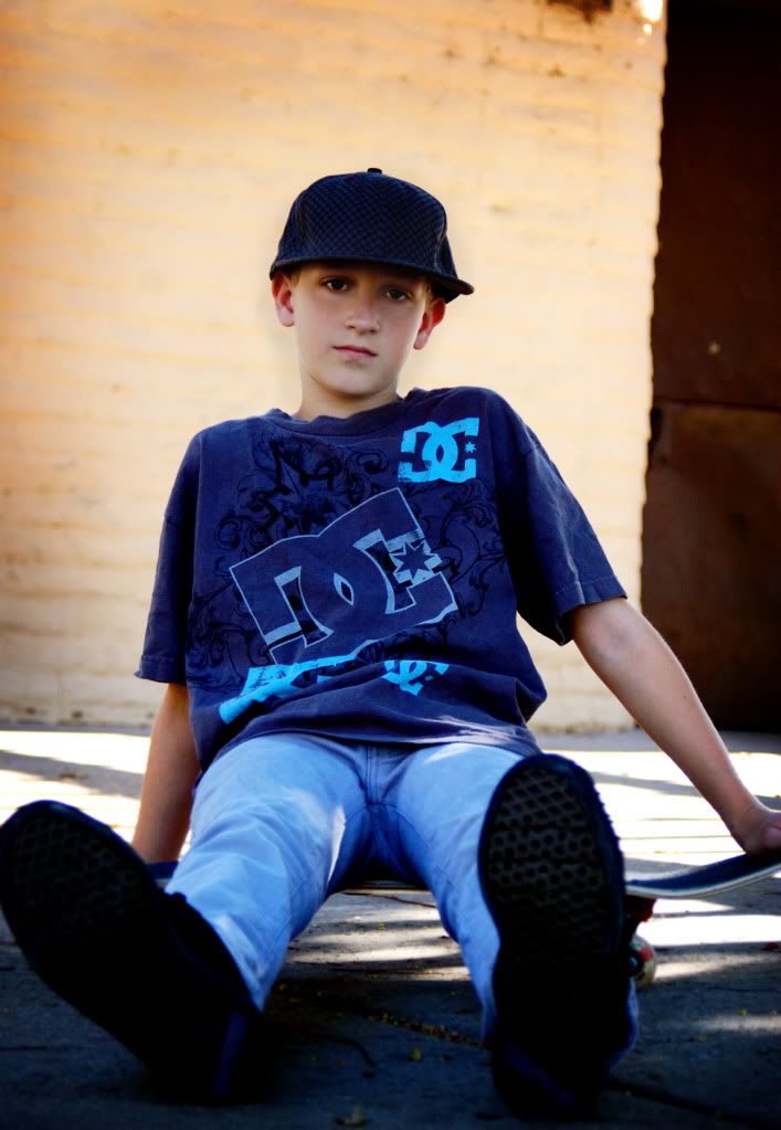
Obviously, in the two photos below, I used a white colored clipping mask.
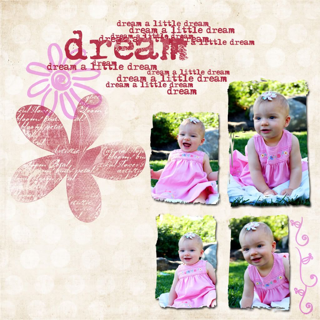
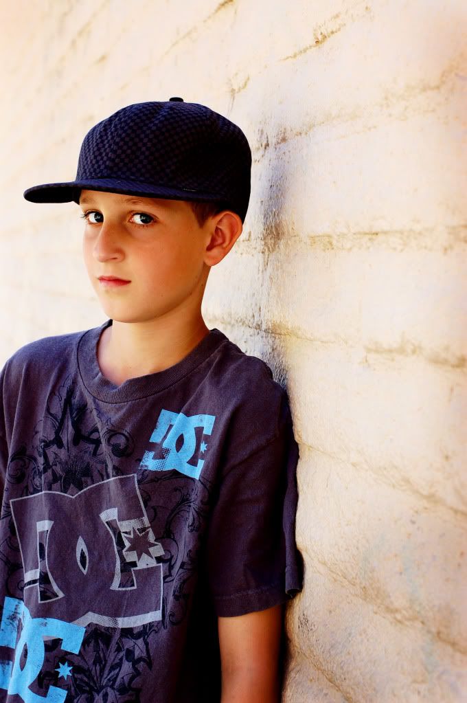
I used the photo below for the FIRST image you see in this post. Once I attached the clipping mask, I dragged this image onto a white blank document. I added a dark scratch overlay (using a layer mask to erase the effect of the overlay from the photo) and then added some fun text.
I subscribe to thedigitalscrapbookteacher.com. I own her book which is where a lot of this started. (See my previous post titled 'computer smarts???? Here is a Start'. Each month she emails a newsletter with great scrapbooking tips. Here is her latest one. If you like it, subscribe at her website for more.

Open your software and open a new blank document at 300DPI, white background, RGB color.

Click on the 'new layer' icon in your layers pallette.
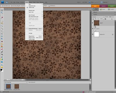
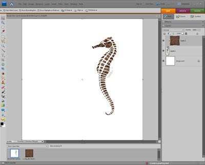
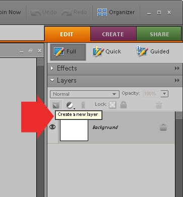
Now, pick a brush and stamp it directly onto that new layer. In this example a SEA HORSE will be used.

Now, open a paper of your choice (this example is using a flowered brown paper). Once opened drag in down onto the brush stroke in the project bin. It will appear that you have two pieces of paper open in the project bin, but if you look to the right in your layers pallette, you will see 3 layers, with the paper layer on top (which is why you can't see the Sea Horse brushstroke anymore)
Now, with the paper layer selected click CTRL+G (which will group it with previous). You paper has now taken on the shape of your brush.