
What are Blending Modes? From your photoshop software, you will notive a drop down menu in your layers pallette. It defaults to say "normal", but you can click on it and see several types of blending modes, like color burn, linear burn, overlay, etc. So here is what that means.


 to this AFTER:
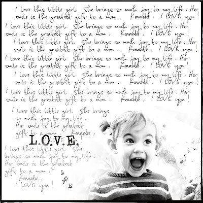 but, I played with it enough to make the background as light as possible after first making it black and white. Once i did that, I placed the photo onto a 12 x 12 new page. I placed it in the corner. I got my eraser tool and set it to 33% opacity and erased around the edges of the photo so it wasn't a blunt rectangle. Then I got my type tool and wrote a few sentences about my daughter, copy and repasted it all over the 12 x 12 layout, staying clear of the photo part. I used my eraser tool with a low opacity to lighten up the text on the bottom left hand corner so that when i wrote the word l.O.V.E, you could see it better. And I finished it off with a border.
Let's say you open up a photo. Now click on the thumbnail of that photo in your layers pallette and select duplicate. Now you have the duplicate image on top of the orinial image. Because your blending modes is defaulted to normal, your photo will look the exact same. Now, with the duplicate layer selected, chose a different blending mode. Below, you will see what different blending modes will look like when you blend a photo with it's duplicate.

Well, now you may ask, what will my photo look like if I blend it with something else. Well, you will only know if you try, but below you can see what this photo looks like when blended with a neutral piece of scrapbook paper.

Now this can very addicting as you now try to put several blending modes on top of eachother. So let's talk about the first photo of this post, with the 4 kids on the bridge.
First I opened the photo and then I dragged a neutral color paper underneath of it. I chose the blending mode, linear burn.
2. I made a duplicate of the photo on top of it and chose blending mode, screen.
3. I made another duplicate on top of that one and chose, linear light.
4. You will have to play with the opacity of each layer to taste. I wanted to desaturate it a little, so with the linear light layer selected, I clicked on image-adjustments-hue/saturation. Once the pop-up box came up, I slid the slider down, to decrease saturation. Do what looks best for your photo.
5. Finally, I took the same paper from the bottom and added a new layer with it on the top and used the blending mode, saturation. Now I am liking the way this photo looks. You might spend hours getting exactly what you want, but practice, practice.
Now, I can't remeber the exact blending modes I used to go from this BEFORE:
 to this AFTER:but, I played with it enough to make the background as light as possible after first making it black and white. Once i did that, I placed the photo onto a 12 x 12 new page. I placed it in the corner. I got my eraser tool and set it to 33% opacity and erased around the edges of the photo so it wasn't a blunt rectangle. Then I got my type tool and wrote a few sentences about my daughter, copy and repasted it all over the 12 x 12 layout, staying clear of the photo part. I used my eraser tool with a low opacity to lighten up the text on the bottom left hand corner so that when i wrote the word l.O.V.E, you could see it better. And I finished it off with a border.


No comments:
Post a Comment